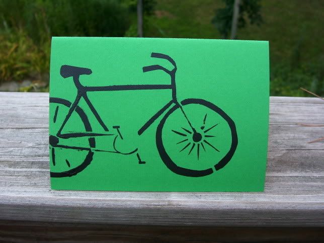
One of the students in my typography class set the poem "The Emperor of Ice Cream" by Wallace Stevens. For the facing page in the French fold she made a carving on an ice cream cone out of some plastic/rubbery material from the art store. I think I may follow suit with this bicycle. Bicycles certainly deserve as much respect as an ice cream cone. Stencils are fun to cut out, but it's time consuming to print more than once, especially when there are so many small fussy bits that need to be taped down.
I've also been spurred on by this typewriter (scroll down a bit) made by abbytrysagain, it's very much the type of look I was going for with these. The brown cover and the stamp go so well together.
I finally got a picture while I'm wearing the earrings:
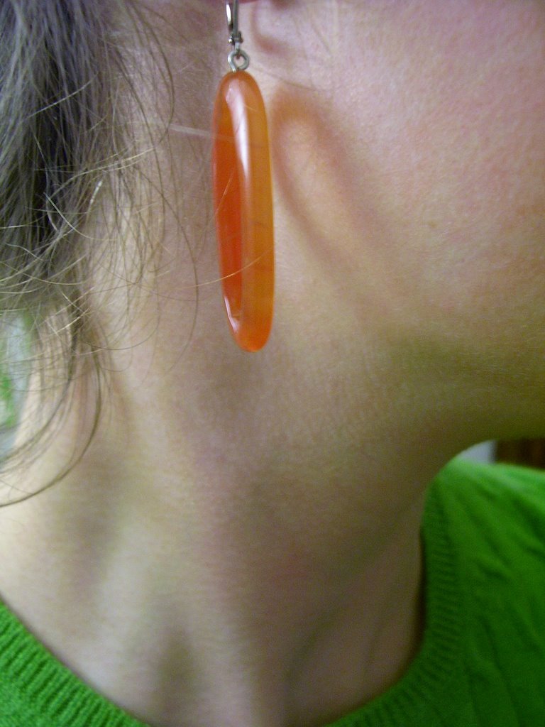 You don't want to know how many pictures I deleted before deciding on this one. Thank goodness for digital cameras! This green is currently one of my favorite colors. As much as I hate to say it, blue tones may have been completely overthrown. If you take a glimpse behind the wispy hairs on my neck you can even see a hint of green from my walls. I bought three large sheets of green paper with a white magnolia and chrysanthemum pattern, and it makes such a huge difference having a large block of color on my wall.


4 comments:
Love the earrings - and the bicycle...
Thanks, I'm quite taken by them. I feel a little awkward about the bicycle; I just saw that one of the new designs in the abbytrysagain shop is a bicycle not too different from this one. I'm glad I posted when I did. It's clear to me, at least, that I haven't taken her idea since I actually made the stencil and card during the summer, but I feel like it is an unfortunate coincidence.
as Papoo likes to say, "great minds think alike!"
Yeah! So glad to see that you're wearing the earrings. They work well with your green sweater! Hope you like them.
Post a Comment