Every year the chapel has a Vespers service the first weekend of Advent. They have two services because so many people from the community come to the services that they can't all fit in the space at once. There's something really amazing about singing Christmas carols for (and with) a thousand people. It's also easy to blow out your voice; towards the end I'm always feeling a bit raspy.
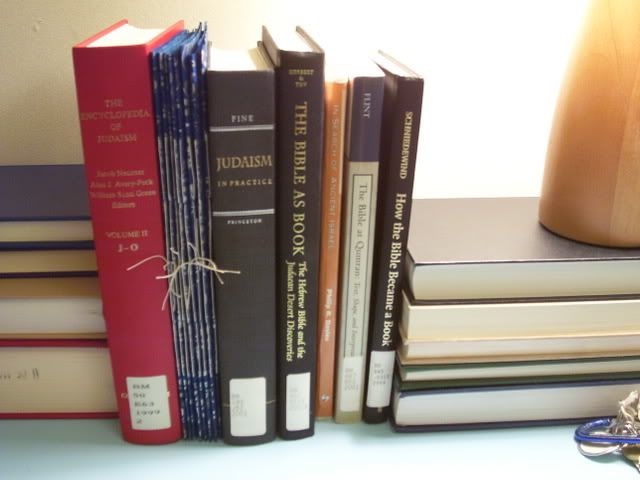
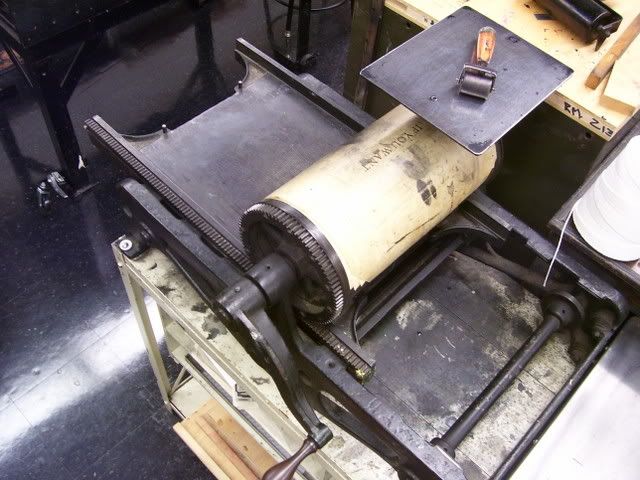
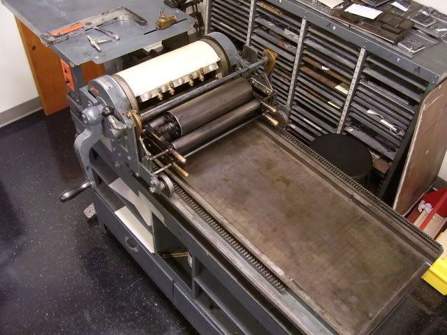
Somehow in all the craziness of this weekend I managed to get to the typography studio and completely finish setting my section of the story. Here's a quick tour through setting type.
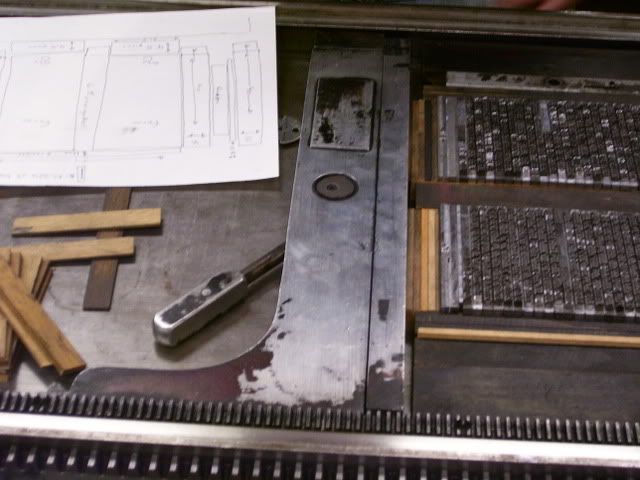
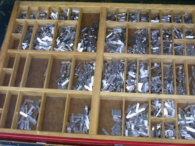
The first step is to fit as many words in the line as possible (or necessary) without any space between them. This line is the end of a paragraph, so I don't have to figure out how to distribute the leftover space. You can see I've put two points of space between each word and then driven the line out-filled it up so all of the letters are tightly packed in.
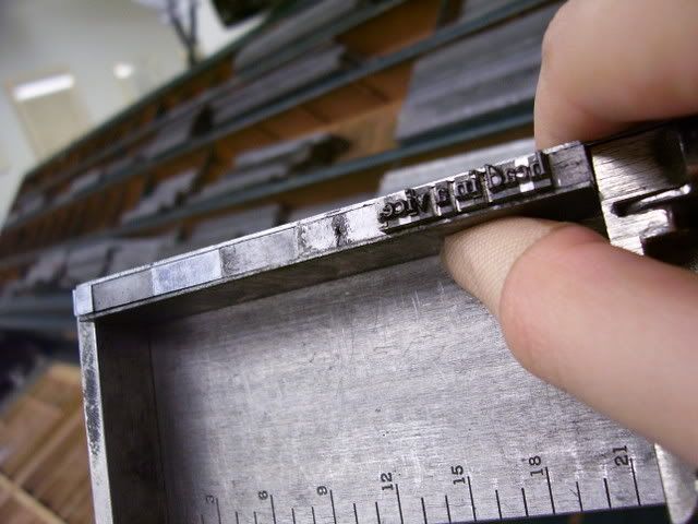
If the line had been in the middle of a paragraph, after putting even spacing between each word I would still have a little bit of wiggle room. I'd start by putting little slivers of space between combinations of straight letters, for example -d b-, -d h-, or on both sides of an I. After filling those spaces I would move to straight-curved combinations (such as -d e-) and then to all the remaining combinations of curved letters.
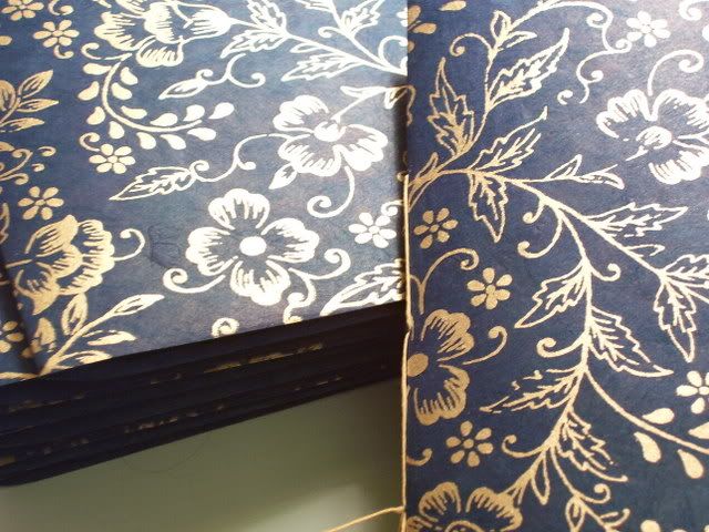
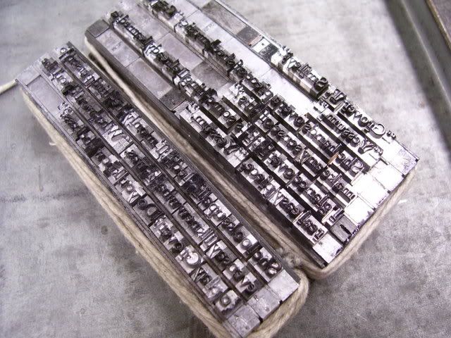
You can see above that the composing stick isn't long enough to set long sections of text at one go. This is a good thing; the lead starts getting heavy very quickly towards the end of a 3 hour long class. Once the composing stick is full, we tie the forme off (Old English, not a misspelling) with twine to keep letters from falling over. The next time I have a photographic assistant with me I'll get some pictures of the process. For now I can show you a finished product.
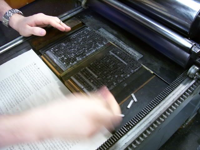
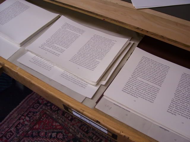
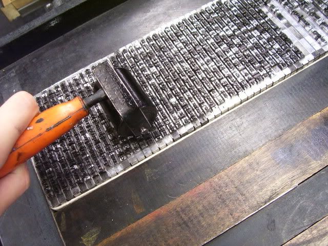
After I finished setting my section, I made a first proof with the type still tied off in smaller chunks. I've made my corrections as I've untied each section, and now I'm ready to do a second proof.
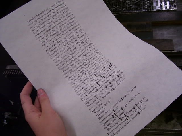
You can see at the bottom where we ran out of letters. The black rectangles are the bottoms of pieces of type; we replaced missing t's with r's, and missing e's with c's, since they are about the same width.
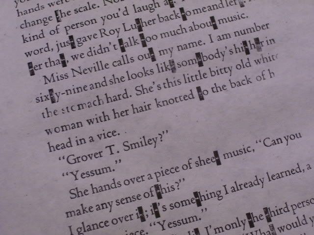
Can you find the line where I got lucky? One day when I came in a few t's had appeared in the case I was working on, but it clearly wasn't enough. The foundry did send us letters we were short on, but that wasn't enough either. The sections at the beginning and the end all have the right letters, but since I'm right in the middle I'll have to wait until they've finished printing and can start distributing type.
Tomorrow (if everyone is finished) we'll start laying out pages. So far I've been too self conscious to take pictures during class, but tomorrow should be very different from anything we've done before. I may just have to risk it.
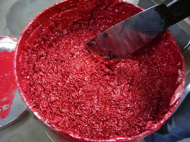 Isn't that amazingly gross looking? Apparently no one has used this ink in a while. The crust on top was more than half an inch thick. Gross! There's another tub of red ink, but it's a little darker than what I wanted. This is the title page with the darker red:
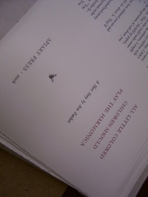 And here's my arrangement, both the black and two-colored version.
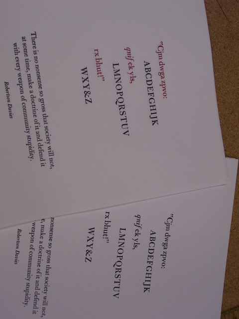
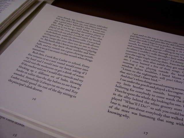
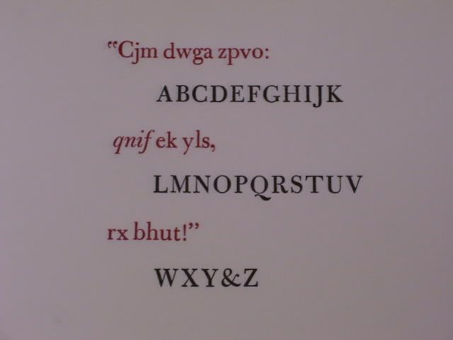 I'm quite pleased with how it came out. The quote at the bottom seems kind of hard to read in the first picture. This is what it says: